00:00
00:00
Kiloru
all systems nominal

Kiloru Kien @Kiloru

Age 29, Male

Soviet Russia

Joined on 1/24/13

Level:
15
Exp Points:
2,492 / 2,500
Exp Rank:
23,413
Vote Power:
5.75 votes
Rank:
Civilian
Global Rank:
94,830
Blams:
11
Saves:
45
B/P Bonus:
0%
Whistle:
Normal
Medals:
167

Kiloru reporting

Posted by Kiloru - October 20th, 2014


Progress report or something like it

First. Battle system is complete. I will made an interface (with hp/status bar/etc) and few extentions for effects/conditions a bit later, technically, it's finished. 

http://www.newgrounds.com/dump/item/18afdbfa9f896755ca772f99a92a507a

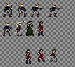
Second. A progress of drawning is...ugh, minimal. All I done is a few sprites...twas sad.

4468939_141381998373_.jpg

That's all for this moment.


EDIT#1: 

1. Fixed the problem with floating texts(?)

2. Changed the battle window size; interface in progress.

3. Color of floating texts of healing spell changed to green


Comments

looks good. :P

If you will find any bugs, please, leave comment or PM me.

The legs of the main character are looking incredibly awkward, since they are spread apart so widely. The frame where he's preparing his attack more looks like he's dodging, but meh, it's alright, I guess.
Something's not right with the face or the hair of the furry character. The hair is forming a sharp corner on top of the head.
I'm seriously, the legs of the main character are looking silly, even funny! :D Even in his default, unanimated pose.
The rest is pretty, no mistakes noticed.
But wait! There's an animation of the last character at the bottom. On the second frame he seems to have shifted his weight to his right leg (HIS right leg), although the knee of it is not beneath the body, which is incorrect and, indeed, more looks like he's jumping in the air than standing.
If you are tired - I understand that perfectly - let me do the animation job for you! Ha-ha-ha! This is going to be amazing.

OH, I completely missed the SWF.
First of all, when I right-click, I can see a context menu with "Zoom In", "Print" and other crap options which you should pray the player doesn't try to use. To disable those use code
var menu:ContextMenu=new ContextMenu();
menu.hideBuiltInItems();
_root.menu=menu;
end of code.
You can add your own options to that context menu, like links to your NG page, or to pages of the music composers, etc, if you want. You can add senseless crap which doesn't mean anything, too.
Next, I'd like the battle screen to cover a larger area, just so that I could not see the inventory button and the level scene beneath the battle scene. They're distracting.
Now, onto the gray rectangles around the character images in the battle. They are not looking pretty, and the purpose of them is uncertain. But it is certain that they don't look good to my eyes. So I'd remove them.
The other problem is that I don't always see "15" text as soon as a projectile hits a target. It might show later. Or it might not show at all. I just don't get it. Hits should be registered as soon as the projectile lands on the target. If the projectile was blocked, it should say so by displaying "blocked" text. Otherwise I don't understand what's going on with those numbers and damages from attacks.
Also, the healing text needs to be green, just so it's more distinguishable.
You should add transparency to those orbs. I know it's placeholder animation. I could do something more awesome in GIMP.
The battle system and movement and dialogue and interactions seem to work fine. Well done. New improvements might bring new bugs.
If you feel like something is hard, I'm always ready to jump in unexpectedly and rock'n'roll.