1. Updated .swf file - now, sudden bug of non-dissapearing invisible menu in battle is fixed (you could see it when double-clicking a skill, for example).
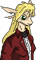
2. I tried to draw a dialogue portrait for one of characters (dragonmorph agent named Kero). What cam be improved?
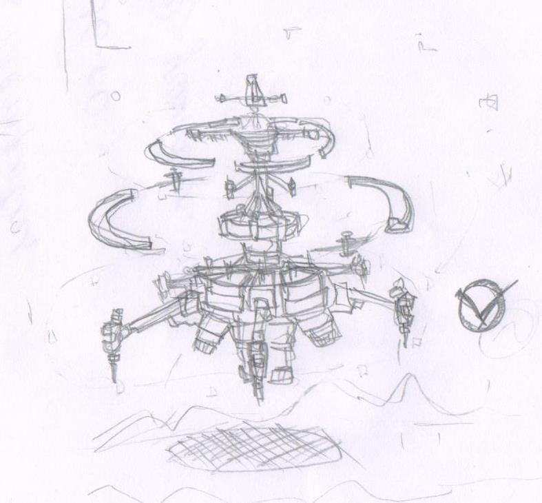
3. Finished concept of dragons' tower. It looks like asymmetric space statioon, lol. And yes. THIS IS NOT STEAMPUNK AT ALL. Better definition is something like 'magitech', i think.
kkots
The neck and the way head sits on it, and the head itself, and the facial expression are outstandingly weird and messy.
The neck is thin and incredibly long and you don't have to draw sternocleidomastoideus if the neck muscles are not strained (the muscles are visible only when the head is tilted at certain angles, if the neck is relaxed the muscles may be excessive to draw with black lines, use slight shading instead).
The neck connects to the head at a wrong place. It's waaaay into the chin. You do not have to separate the chin from the neck with a black line. For example, take a look at this: http://www.newgrounds.com/art/view/megawolf77/hey-renamon
Next, the shape of the head. It reminds me a boot, an L shape. The forehead is way too tall. And in comparison the nose (or whatever it is that stands out of the head) is too short.
Finally, the facial expression.
The eyes are very big and do not show any expression. Big eyes usually mean a kind-hearted character. The eyebrow is kind of neutral, not showing anything special.
The mouth more looks like the character is upset? :L
I really, really think that the boobs are on different heights! I really think that, and if I could, I would fix that immediately! The boob on the left is way lower than the right boob.
The hair does not like anime style. It's not Releqium style either. Maybe you're going with a unique hair style, but I must warn you that the left-most tress (прядь) of hair looks bad due to its straightness and thinness.
I did not expect so many disappointments from you.
You must draw more on computer. And you must draw more in pixel art before you're finally ready to do your game justice!
Kiloru
Кхе кхе
Мне следовало думать, когда я это обводил. А еще лучше - рисовать с нуля, а не обводить. Виноват-виноват. Хотя, для этого, я собственно, сюда все и выкладываю.
Теперь подожди немного, а потом я закидаю тебя переделанными вариантами (я уверен, что с первого раза это не пофиксится).
Также вопрос: по поводу деталей/затенения на одежде и пропорций голова/туловище претензий нет? Просто сейчас мне кажется, что голова немного мелковата, нет?